Feedback App UX
Fdbk ("Feedback") is a mobile web application I developed to allow businesses to collect customer sentiment in real-time, on location. I joined the Fdbk team a few months after they tested an alpha version of their web app, with the goal of making their product more accessible and useful for all kinds of businesses. It was basically a complete redesign from the ground up, using real-world data they had been collecting from existing clients.
Goals
After talking with the Fdbk team and a few of their higher profile clients, we landed on three main goals for the new app:
- Fully responsive web application – Since businesses and their customers use all worts of devices, it made the most sense to build a web application that could be run on any device. Native apps could come later, once we knew more about the customers' needs.
- Features must scale to meet the needs of any business – The product must be easy enough for a Mom & Pop shop to use, and be functional enough for a large corporation to manage multiple locations or branches.
- Needs a friendly and easy to understand UI – The purpose of Fdbk is to encourage a meaningful relationship between the business and their customer. The user interface, then, needs encourage a friendly and productive back-and-forth between the business and the customer, as well as provide easy management features "behind the scenes" for the business to use.
With those three points in mind, I set out to design a next generation customer relationship manager. This is what I landed on:
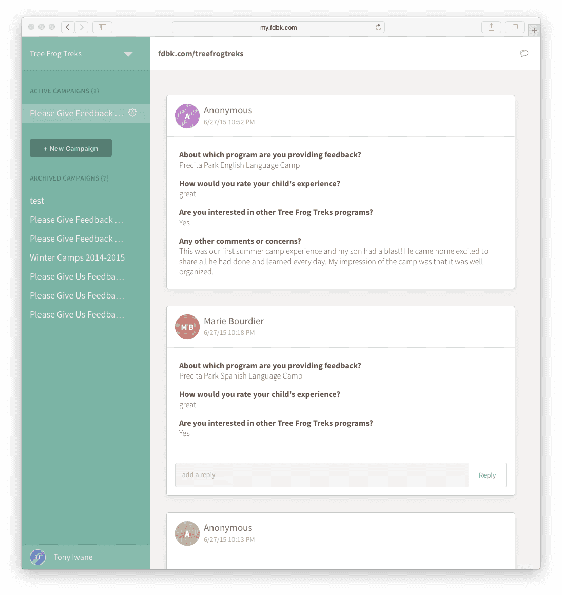
The entire experience is centered around the Conversation Stream. Similar to Facebook posts, incoming feedback for a business appears in a line stream on the main page. Each instance of feedback is organized on a Card, which contains any questions answered by the customer, and any subsequent conversations and related data.
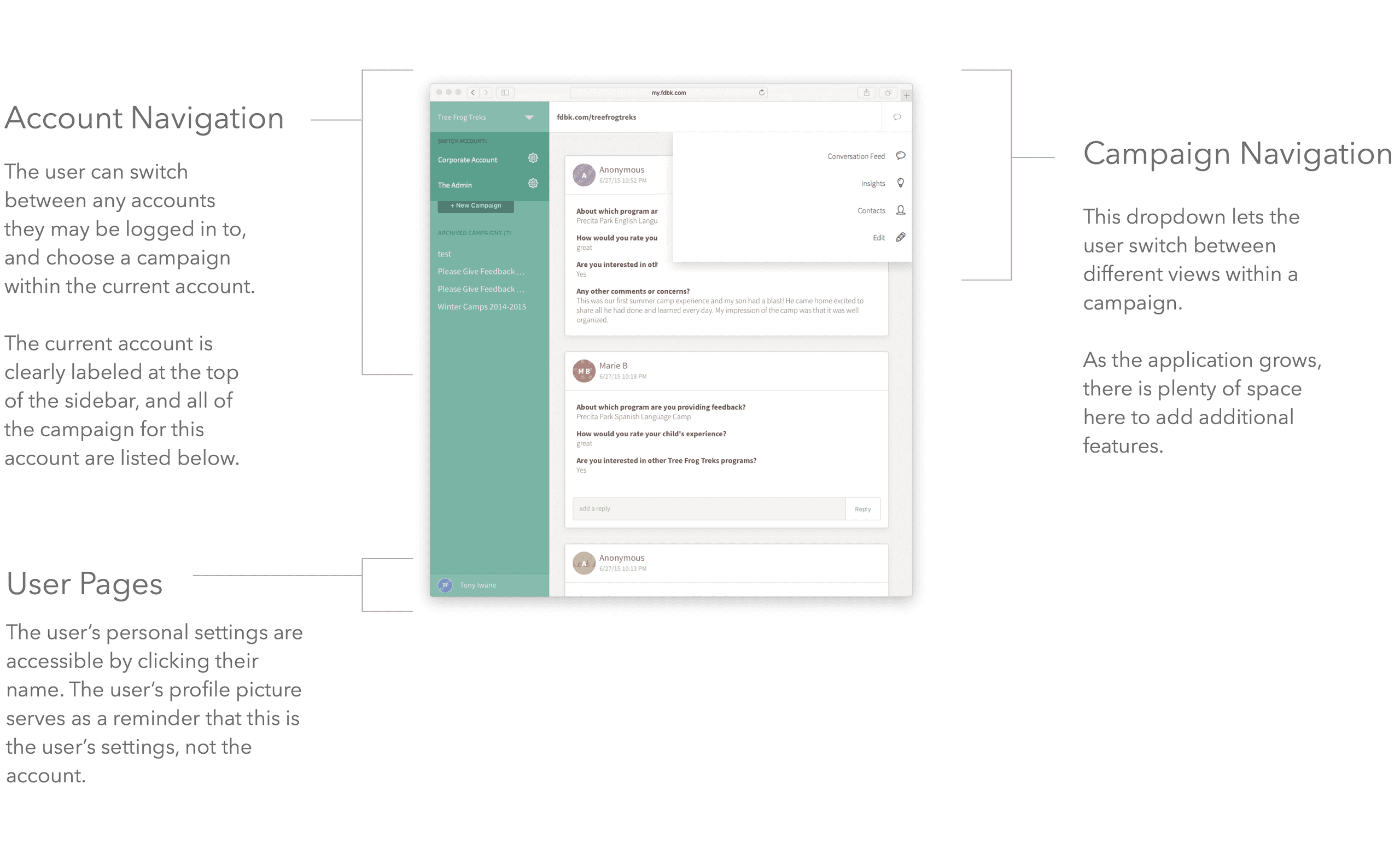
Navigation
Other pages within the app let the business explore all of the collected data in different ways. There is an Analytics Dashboard that shows an overview of customer sentiment through meaningful charts and graphs. The Contacts List lets the business view and reach out to every customer who has engaged with them. All of this is contained within a robust permissions system that would allow the business owner to decide which of their employees would be able to view or respond to each conversation.
The Fdbk Experience
The Fdbk Experience begins when a new user creates a new account, and a short form to spark a conversation. Through user research, we found that the best way to get meaningful feedback is to ask a few short questions (we found the magic number to be 3), and then provide an area for an open text answer. Organizing a form in this way let the business collect actionable data was fed into the analytics dashboard, but helped keep the customer from being bogged down with a dozen questions. The business could always follow up with a customer to collect more data later.
Form Creator
The Form Creator was designed to make it quick and easy to create questions on a mobile device, or on a larger screen. I designed this tool to show the user exactly how their form was going to appear to the customer. That helped put the user in the shoes of the person who would eventually be filling out the form, which helped enforce the idea that "shorter is better".
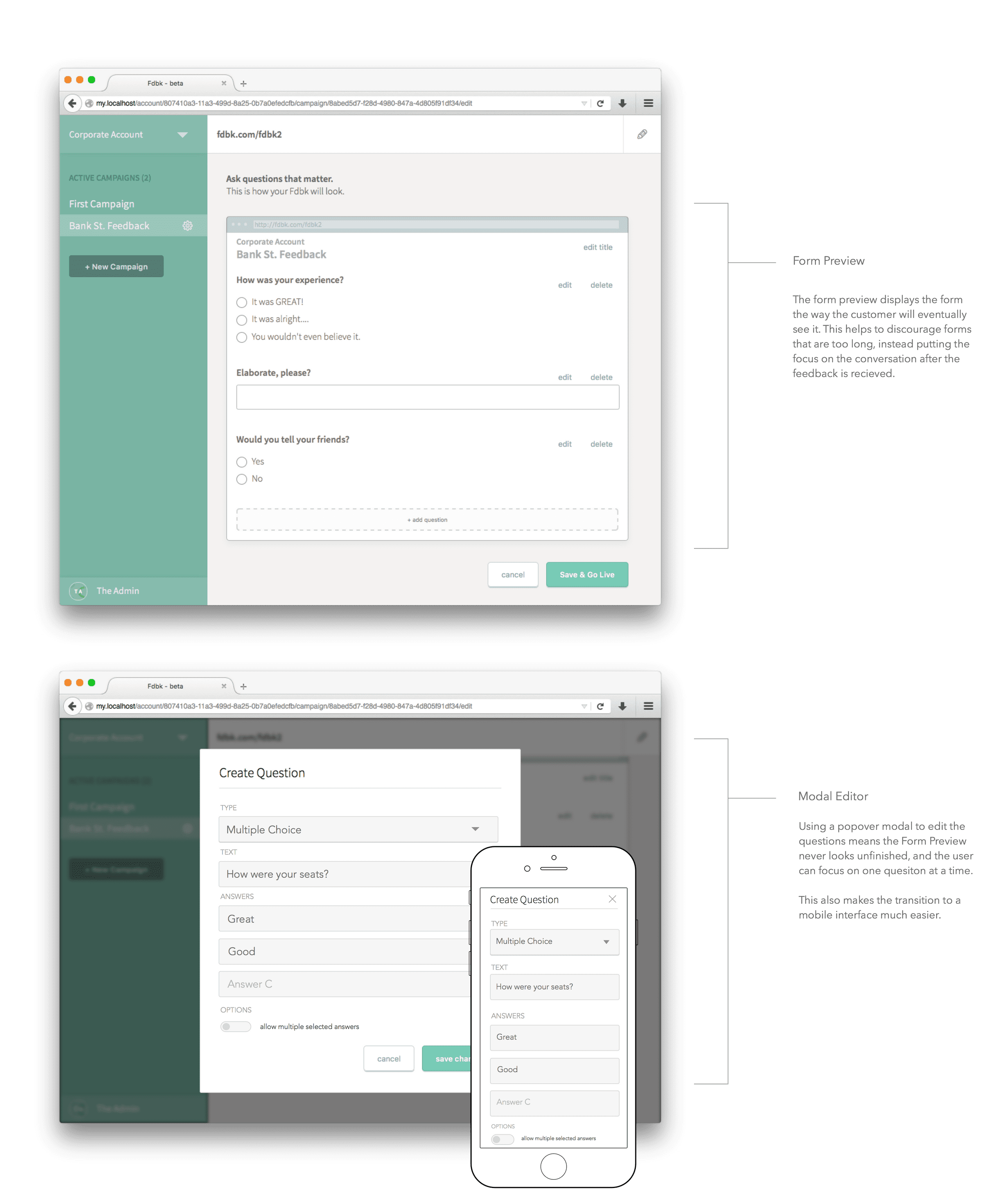
When editing a question, a popover modal made it easier to have a consistent experience on a mobile screen and a desktop screen, and put the user's focus on the question they are creating, not the entire form. Any time the user saw the full form, it was presented exactly as the customer would see it. Any editing screens were always in a popover modal, separate from the form preview.

Filling out the form on the customer's side was simple. When they navigated to the business's Fdbk address (fdbk.com/bussiness-name), they saw a short list of questions to answer, and a "submit" button. After completing the form, the data was sent to the server immediately, and the customer was presented with the option to log in or sign up afterward. This ensured that most of the data was collected, whether it was tied to a customer or not.
The data were obviously more valuable if it was tied to a customer, so to incentivize signing up I used friendly language explaining that the business might want to follow up with their feedback. Thanks to this language, well over 65% of customers signed up with Fdbk, allowing businesses to reach back out at a later date.
Permissions
Once the feedback data has been collected, it gets aggregated into the Conversation Feed and the Analytics Dashboard. We found that the larger business owners (restaurants with multiple locations, for instance) wanted the ability to control what their managers and employees were able to do within the app. Depending on the size of the business, and where their motives for collecting feedback lie, the business may want to limit which data were available to their employees, and which employees are able to respond to customers. I spent a large amount of time designing a robust permissions system that is easy to manage, and flexible enough to work at scale.
Without getting into the database-level of detail, the internal permissions structure that I landed on looked like:
For security and robustness, User Data is kept separate from the Account Data. The dotted lines describe the ways in which a User can access Account data, and are limited to essentially "read" or "write". A User can either have access to all of the account data, or they can be limited to just a set of Campaign data.
A use case for this distinction is a company that is collecting both internal and external feedback (that is, customer feedback, and employee feedback. The Admins have the ability to allow certain Users to view and edit external feedback campaigns, and keep the internal feedback private. It would also allow a company such as Chipotle to give each of their branch managers access to only the feedback campaigns that pertained to their branch, and not bogging down their app with unnecessary data. At the same time, it would allow a barista at a local coffee shop to view feedback related to the shop, while limiting their ability to edit questions or view internal feedback.
This same system allows a business to track User interactions within the app, and hold their employees accountable for their responses. It allows for a social media company that might be managing multiple clients to trace an interaction back to a specific employee, and revoke their ability to respond if necessary.
Analytics and Data Exploration
For the Analytics Dashboard, I used an early iteration of the modular dashboard setup I describe in another post. While I was working with Fdbk, and while the platform was still growing, and it was important to keep the focus of the app on the conversation, with data being a close second. The analytics dashboard I designed fit the basic needs of almost every business I talked to (in fact, most people only cared about the conversation!), and had the capability to show more complex data in the future.
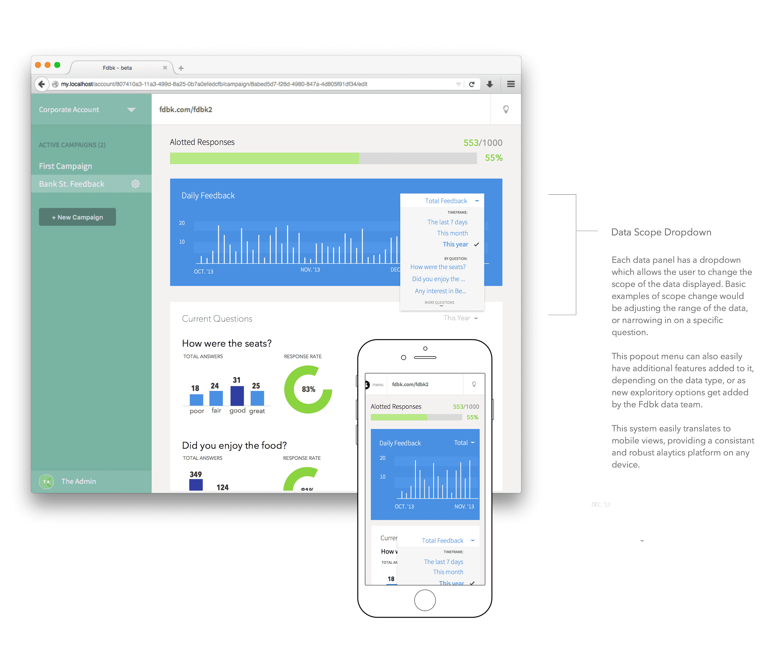
I started off with an overview of the incoming feedback. Weekly and daily totals gave the user an idea of how many conversations were being had, and how current the data was. After the overview, a chart for each question was listed, showing how many customers have answered a question, and what the breakdown of answers were. The user could toggle between "totals" and "trends" to see how customer sentiment was changing over time.
Conclusion
Ensuring the same user interface can scale in screen size as well as in use-case, so that the owner of a local bookstore can collect feedback in their storefront, and a large chain restaurant can manage customer sentiment across one hundred locations or more was a challange to say the least. I feel I managed to accomplish this, and user feedback (yes, I used Fdbk to get feedback) confirms my assumptions. All of the customers I interviewed, said the application was easy to use, and they were able to collect all of the data they were interested in. This held true for single-location stores to resturant management groups to large summer camps with many employees. I would like to have been able to test real-world applications of Fdbk in large chains, but I still feel confident my assumptions would scale as the product did.